— Womplay —
play games and earn crypto
Building a gaming platform with crypto and NFT rewards
How do we attract gamers and grow their engagement?
Building a platform to discover games and get crypto rewards.
What would an MVP look like?
To validate our product and to see if the concept of the platform will be thriving we had to figure out what to start with in order to find acceptance and being used by our customers. Besides the onboarding or MVP included an overview and details of games and challenges to earn points and a prize pool widget to cash out those points in EOS.
What to add and improve for more engagement?
After a successful launch of the MVP and promising outcome in the beginning we enhanced the overall appearance and prioritized new features to improve the experience. One major feature I worked on was the profile page for each user. This also introduced new features like NFTs, editions and missions and was designed to be a themeable hub for the user. Another smaller but important feature we improved over time was the prize pool widget on the homepage.
Designing the MVP
The landing page was designed to show the most important features and content to give the opportunity to act on it right away
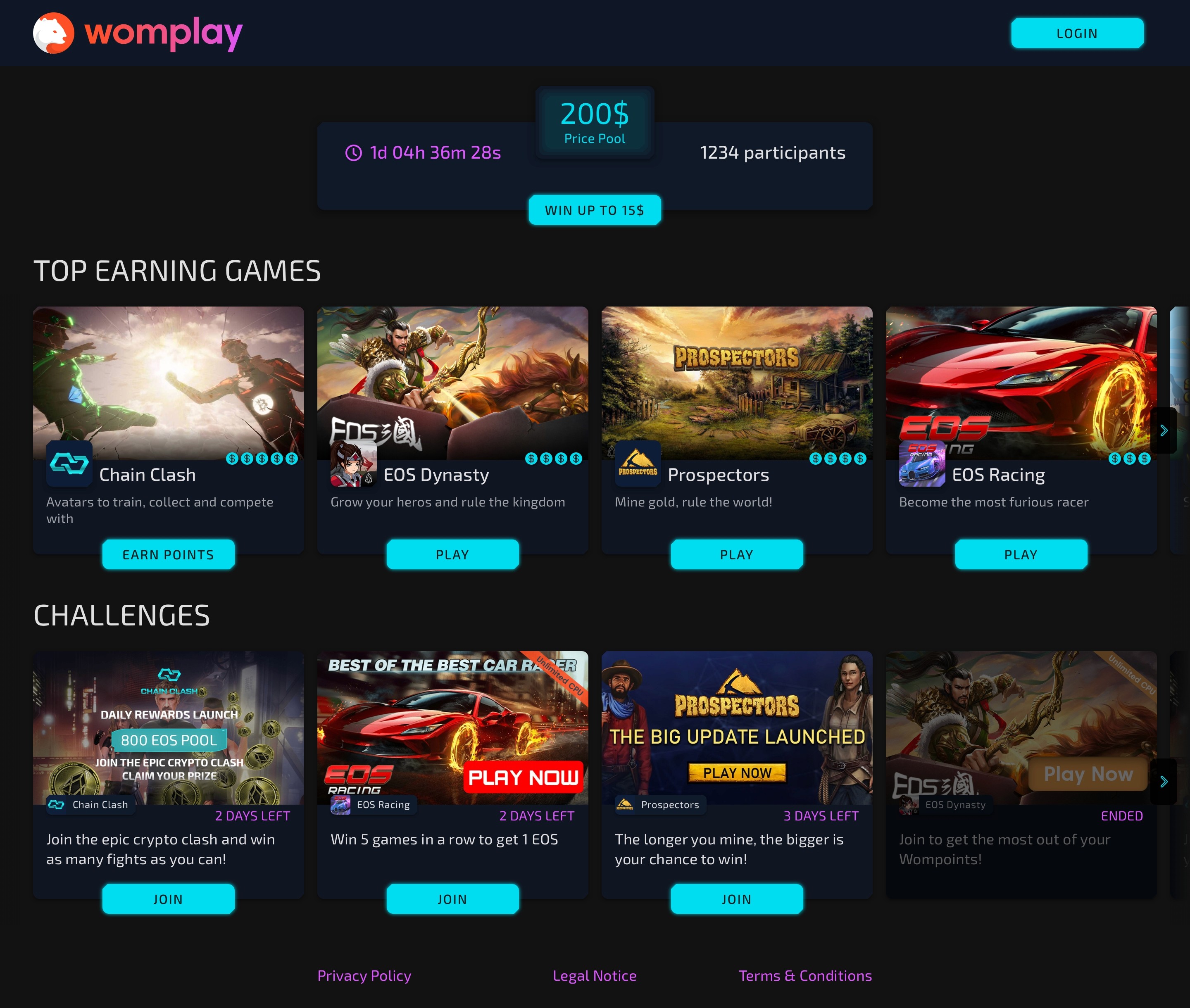
starting with the prize pool widget on top followed by two card carousels with top earning games and current challenges.
The visitor would be able to see details about the games and the challenges in a modal.
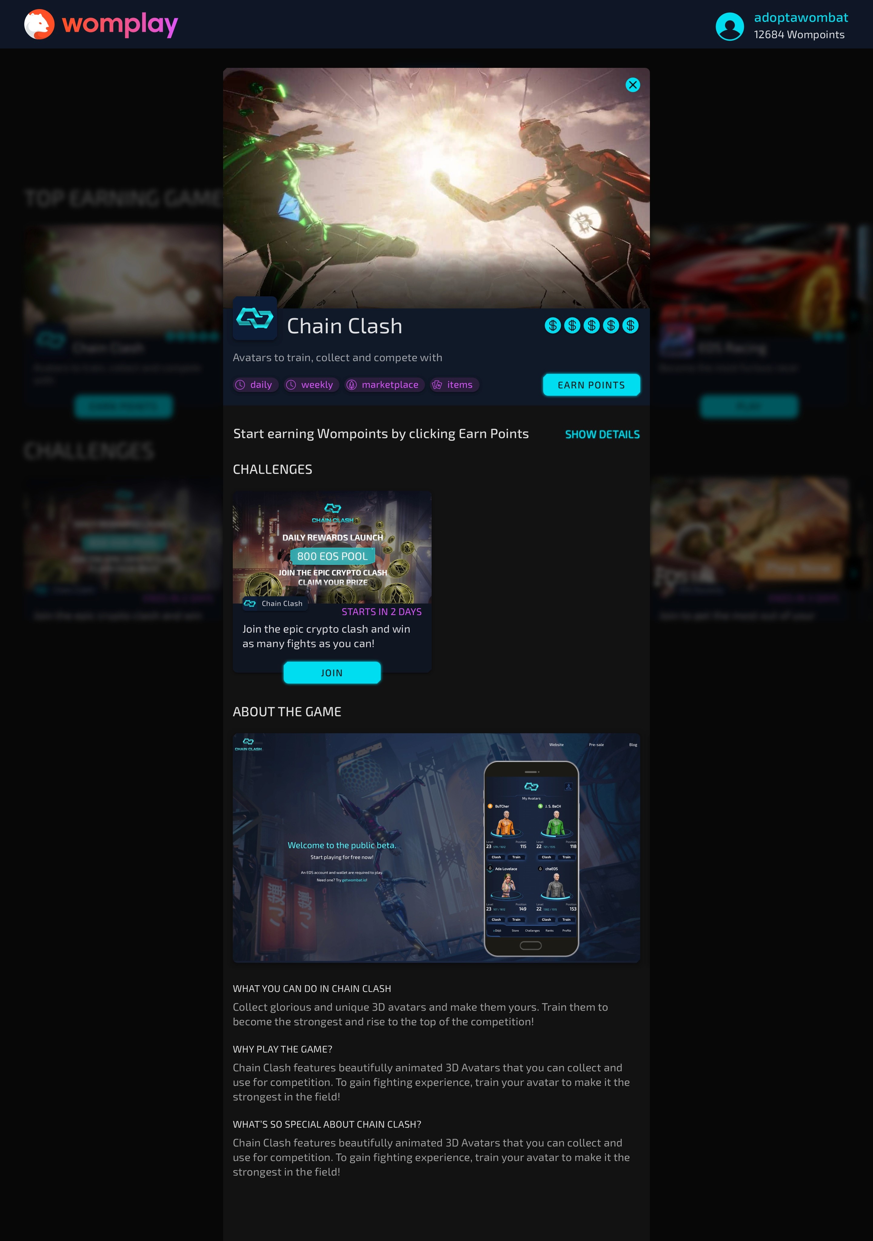
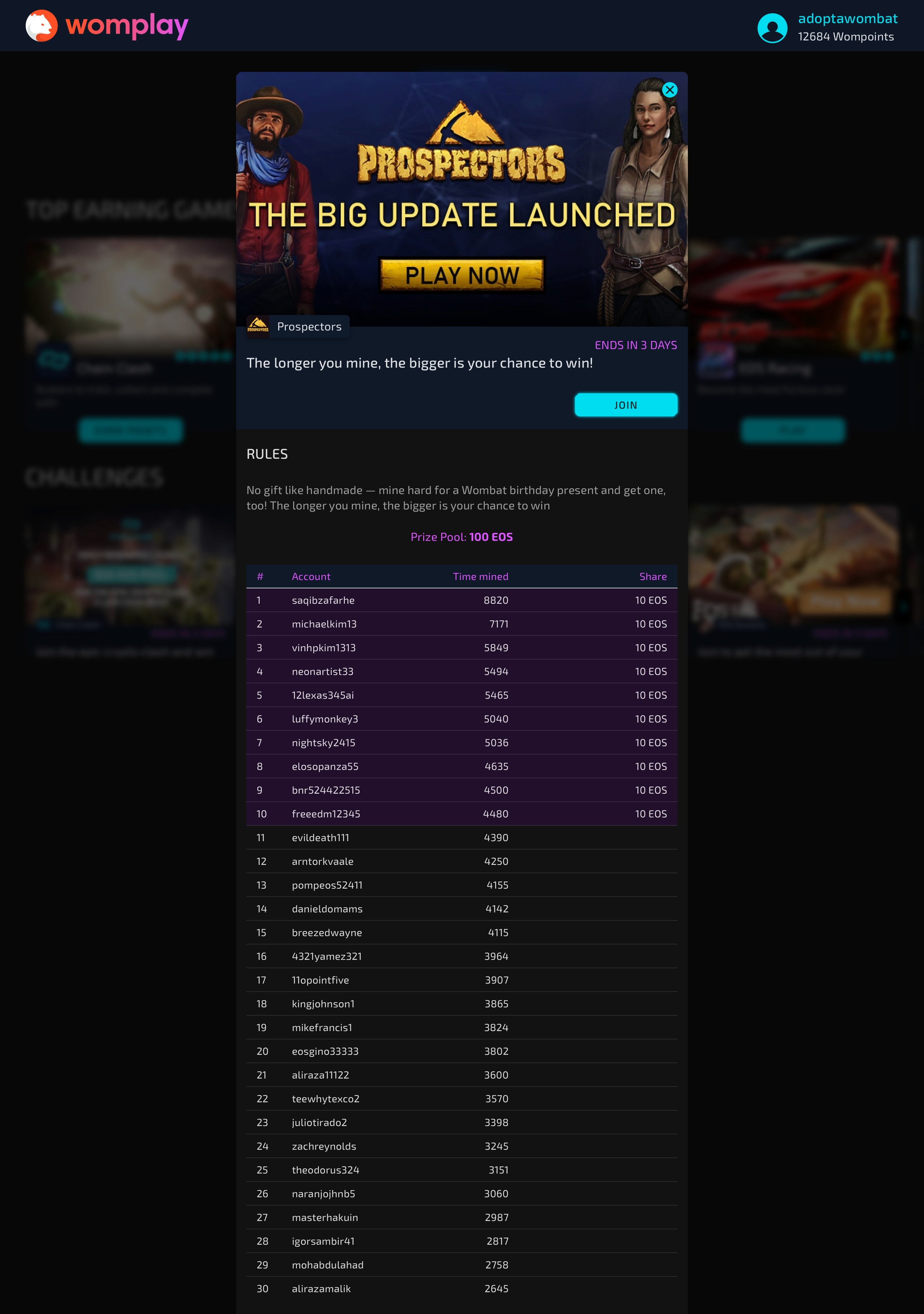
Any other action would require an account and therefore start the registration process.
Profile page as a hub for the user
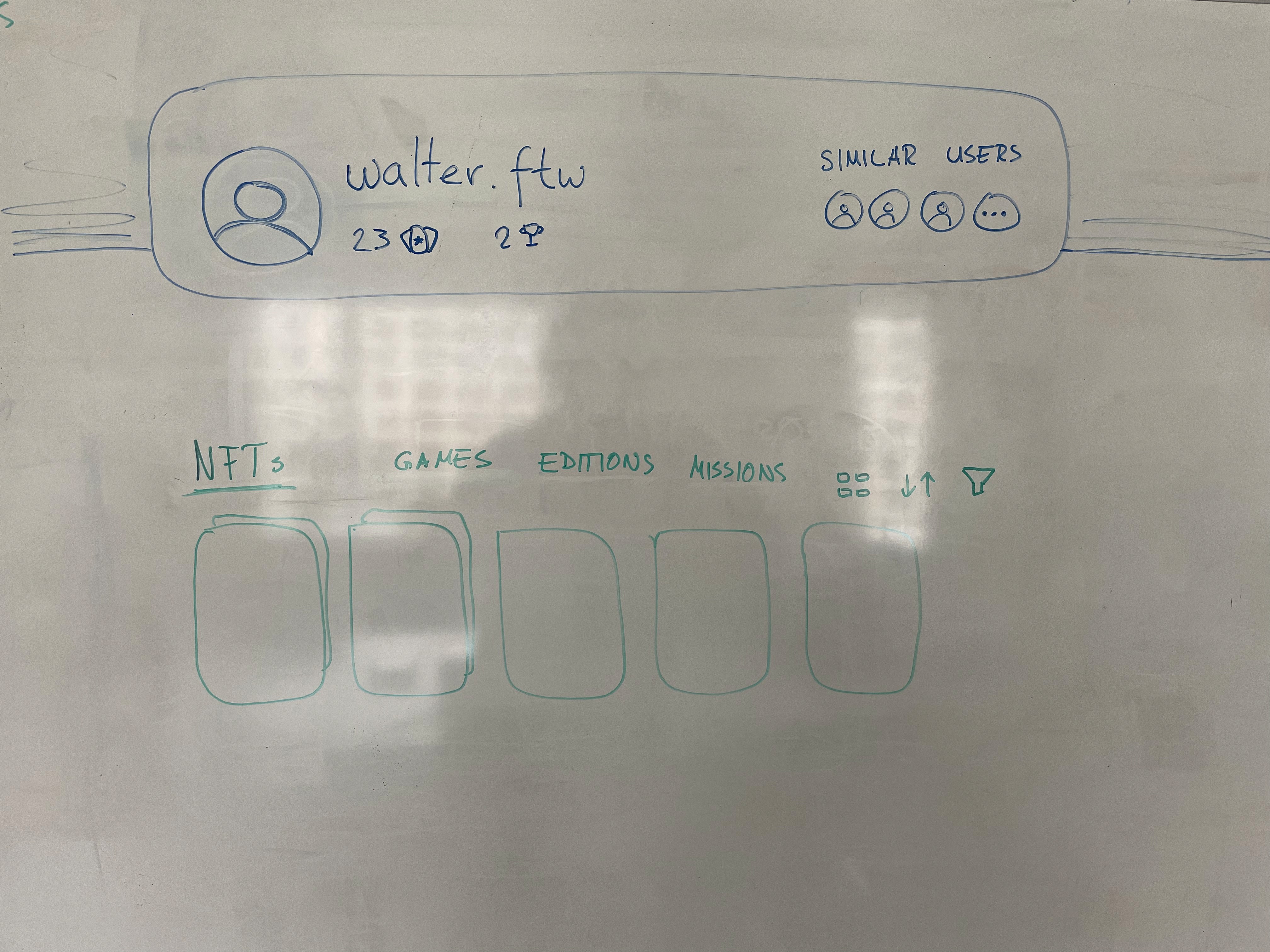
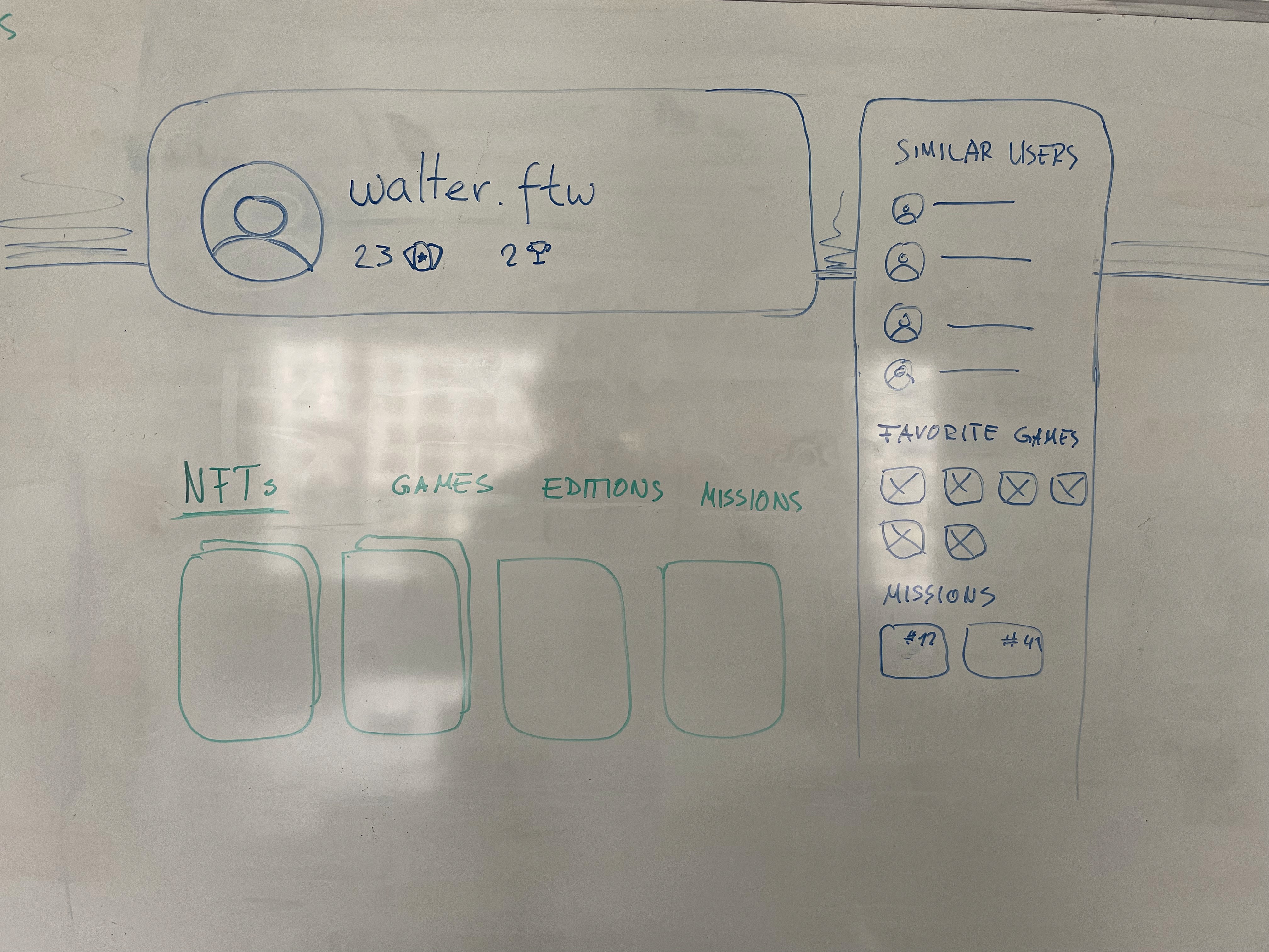
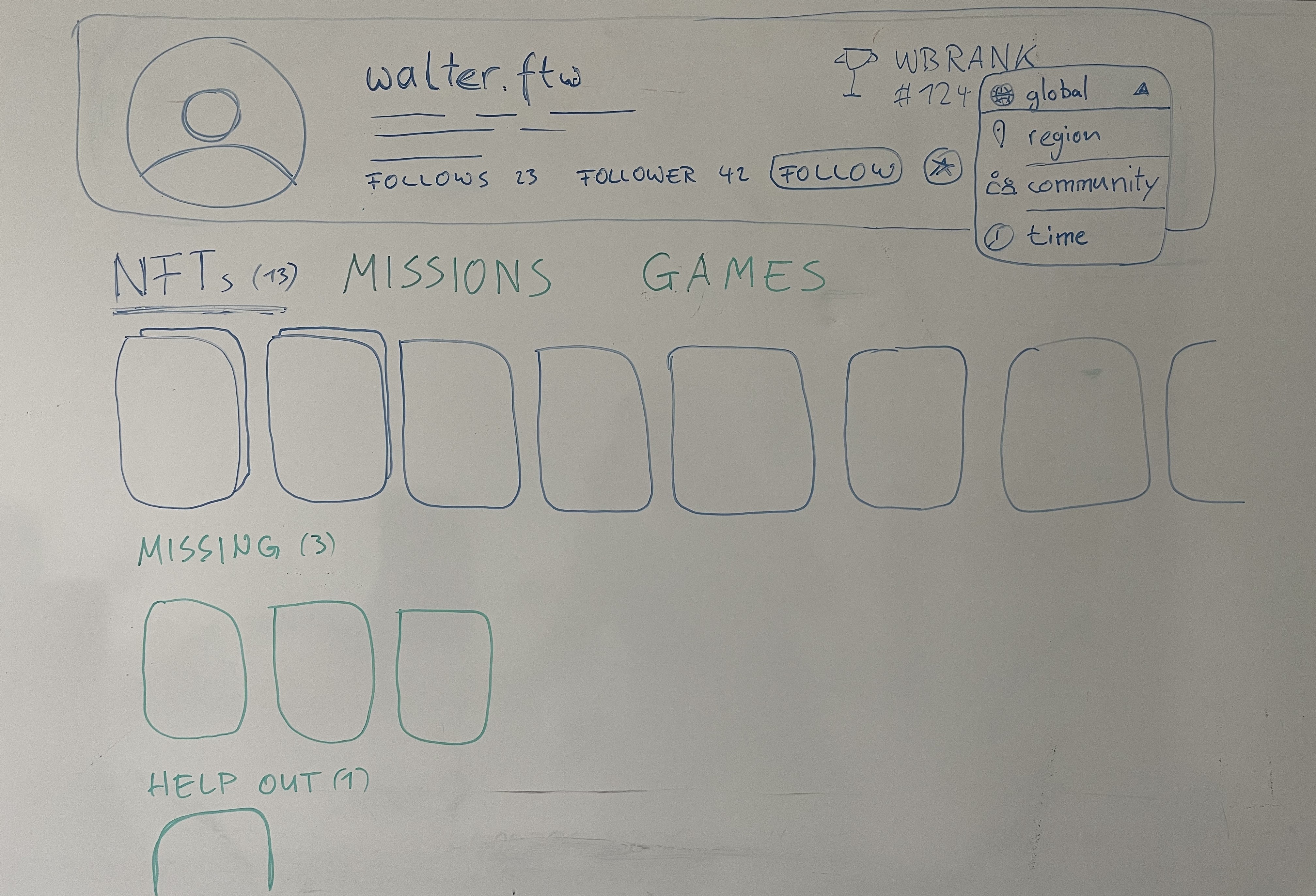
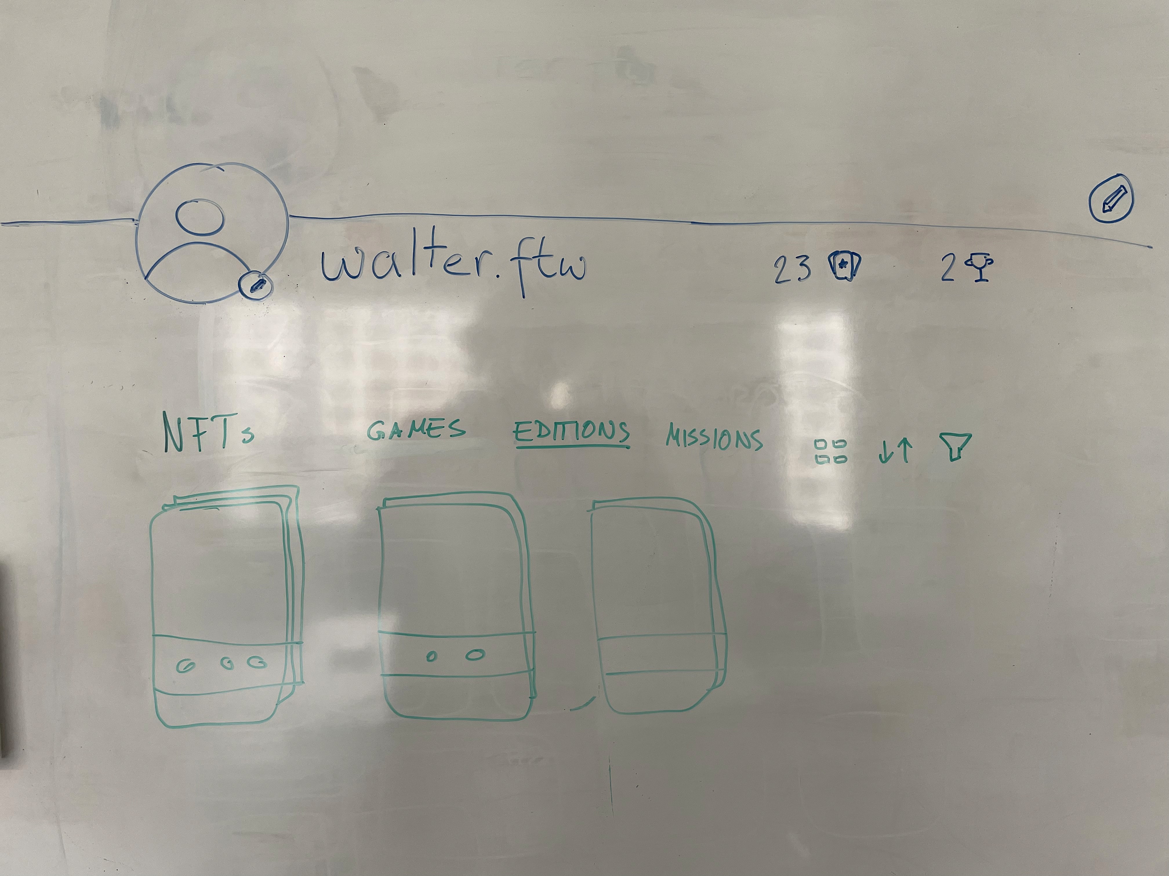
With the profile page we wanted to create a dashboard for the user to display relevant information, collected NFTs, editions, challenges, missions and tailored actions to engage with the platform and other users.
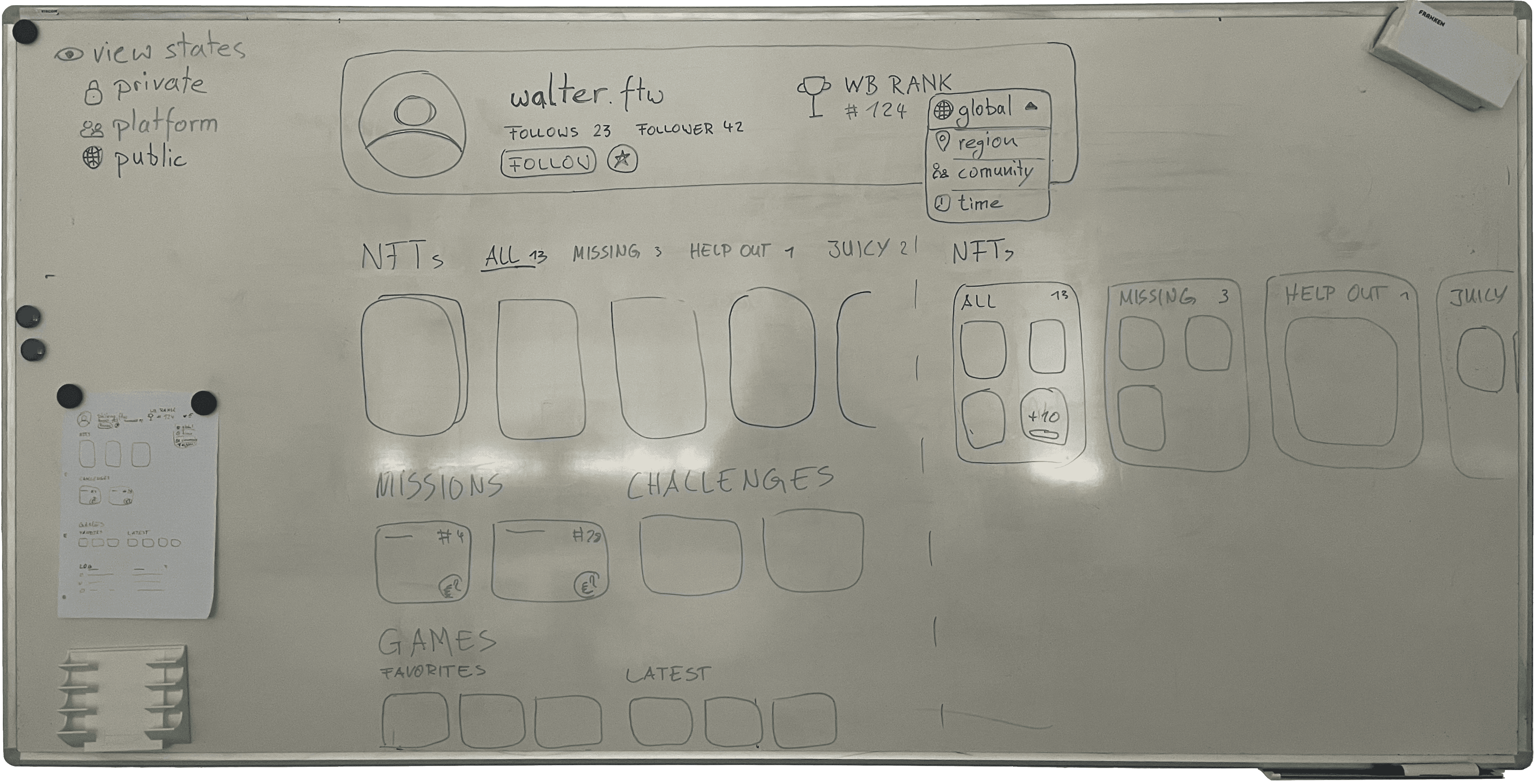
I drafted several approaches to find out in close collaboration with my project manager what looks best and how to show all the content in a tidy way. Serving as a dashboard I designed with a modular layout in mind for simple extension with new elements.
As the profile was also meant to be accessible for other users I designed the page in the next step to be theamable with specific NFTs for the Avatar, the Header section, the background and sets including all three of them.
Improving the prize pool widget
Another smaller but important feature we improved over time was the prize pool widget on the homepage.
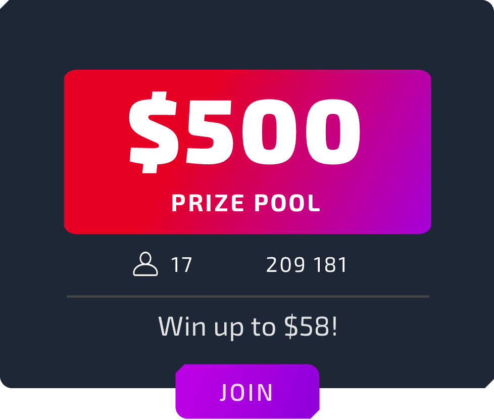
With the first version the user would always stake all their points.
When the cashout became more complex we had to include more information.
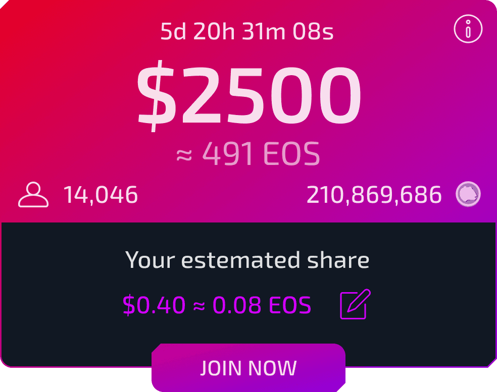
We also added the ability to stake just some of the available points and to top up more some time later.


